
EXPERIENCES AND ENVIRONMENTS AREN’T LIMITED TO WHAT A PERSON SEES WHEN THEY’RE WALKING INTO A DREAM CENTER ATMOSPHERE. DREAM CENTER EXPERIENCES AND ENVIRONMENTS ENCOMPASS HOW A PERSON FEELS WHEN THEY COME ACROSS A DREAM CENTER ENVIRONMENT.
And that means we’re all involved. From an interaction with a Guest or a Volunteer or an Instagram story posted on Dream Center’s account, every staff member and volunteer is a part of creating experiences and environments, at every level, that reflect the heart of Dream Center Peoria and help make stories of life change possible.
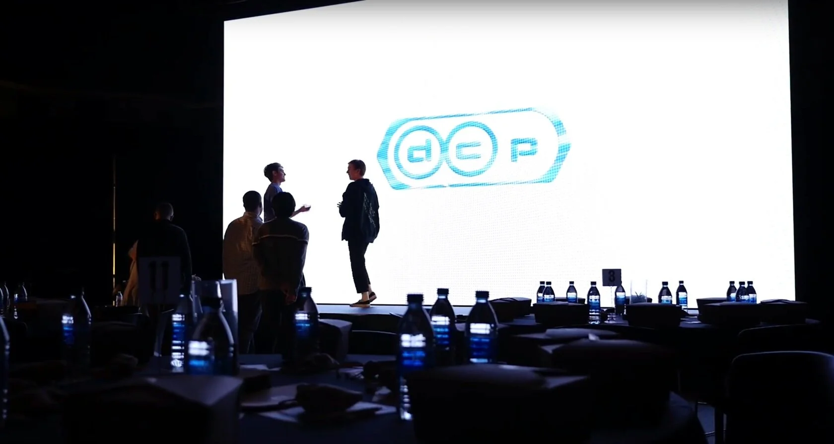
Take a look through The Brand and start to think about it: how Dream Center’s visuals and spaces tell a story, creating spaces that keeps people and their stories of life change at work in the forefront. And please note, this page is meant to be a reference for you, to help you understand more about Dream Center's brand standard. If you ever feel you need to use or share anything here, reach out to the creative team first.
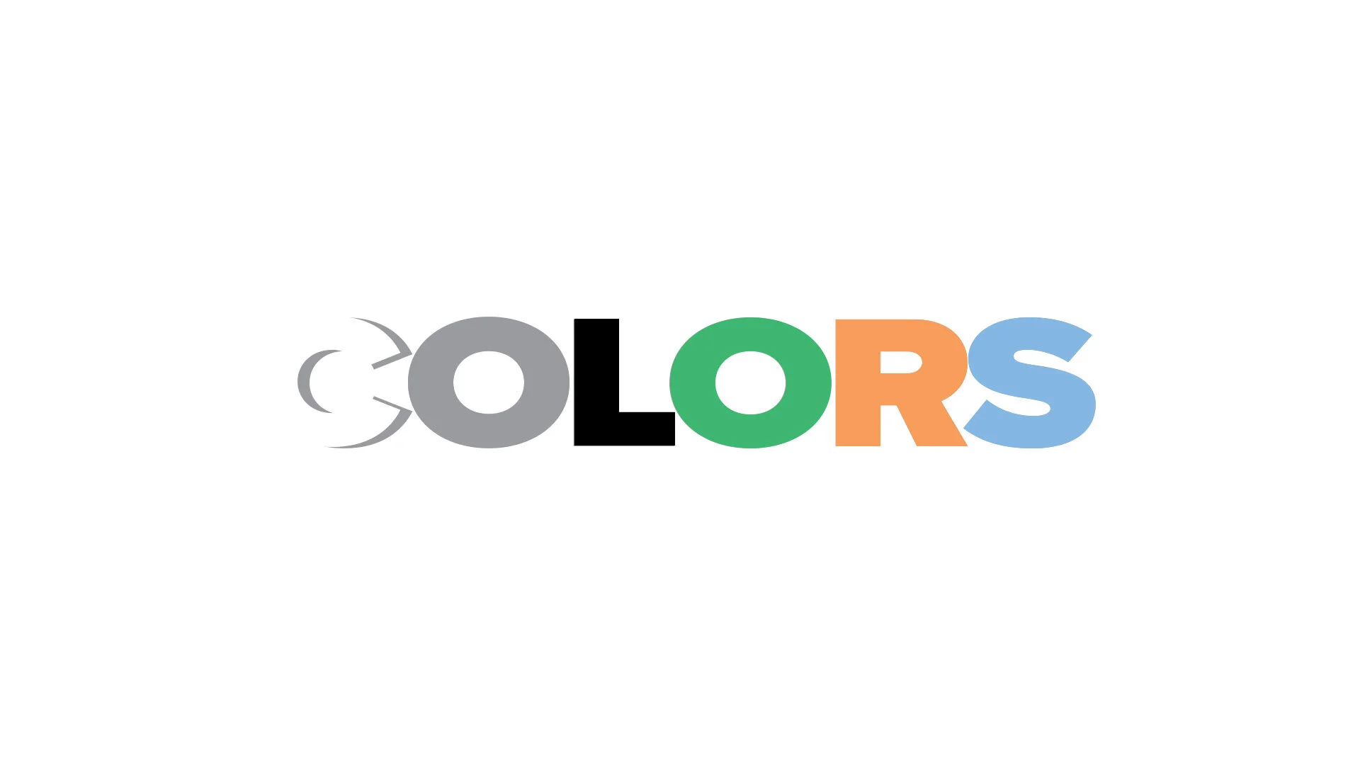
Dream Center Peoria’s Core Colors

R: 255 G: 255 B: 255
C: 0 M: 0 Y: 0 K: 0
Pantone: P 179-1 C
Hex: #ffffff

R: 153 G: 155 B: 158
C: 0 M: 0 Y: 0 K: 47
Pantone: P 179-7 C
Hex: #999b9e

R: 0 G: 0 B: 0
C: 75 M: 68 Y: 67 K: 90
Pantone: 426 C
Hex: #000000
Colors Used to Coordinate each pillar of dream center.

DCP STUDENTS
R: 61 G: 183 B: 113
C: 72 M: 0 Y: 76 K: 0
Pantone: P 142-6 C
Hex: #3db771

DCP CARES
R: 248 G: 157 B: 91
C: 0 M: 46 Y: 71 K: 0
Pantone: P 27-6 C
Hex: #f89d5b


DCP MOBILE
R: 255 G: 214 B: 126
C: 0 M: 16 Y: 60 K: 0
Pantone: P 10-5 C
Hex: #ffd67e
DCP HOUSING
R: 132 G: 184 B: 227
C: 46 M: 16 Y: 0 K: 0
Pantone: P 109-4 C
Hex: #84b8e3
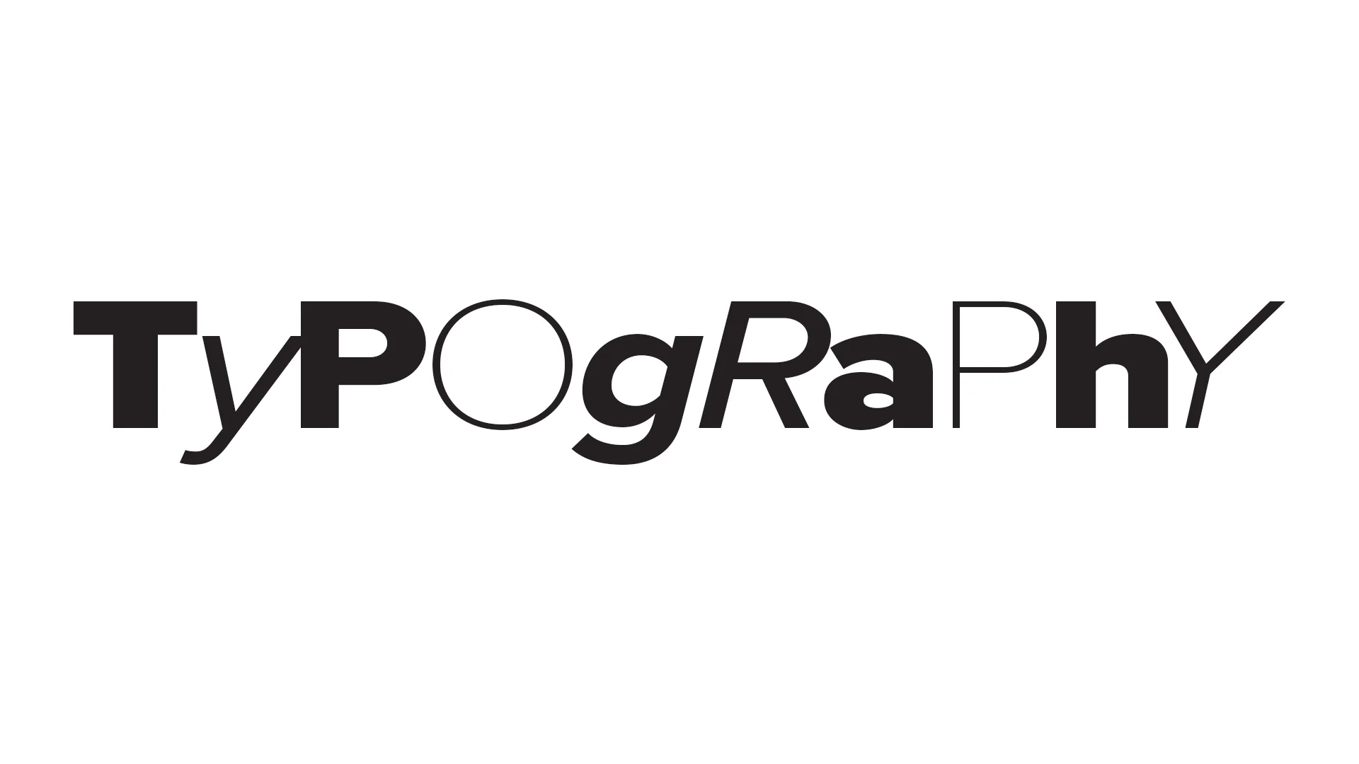
Display Fonts
Display typefaces are used to entice a reader into text copy or to announce important information. Uses include titles and headlines.
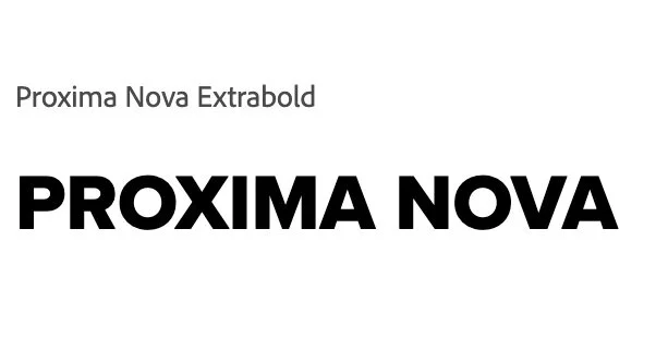
Text Fonts
Text typefaces are easy to read in long blocks of copy. They do not call much attention to themselves. Uses include large bodies of text.

DOWNLOAD FONTS BELOW
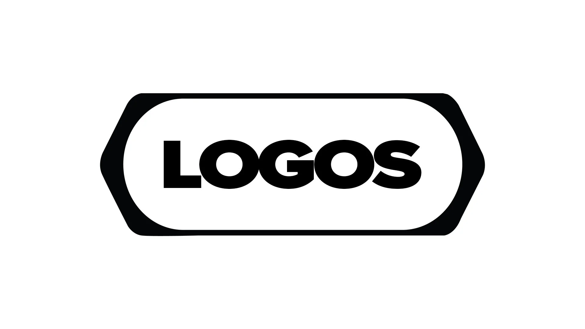
Primary Logos

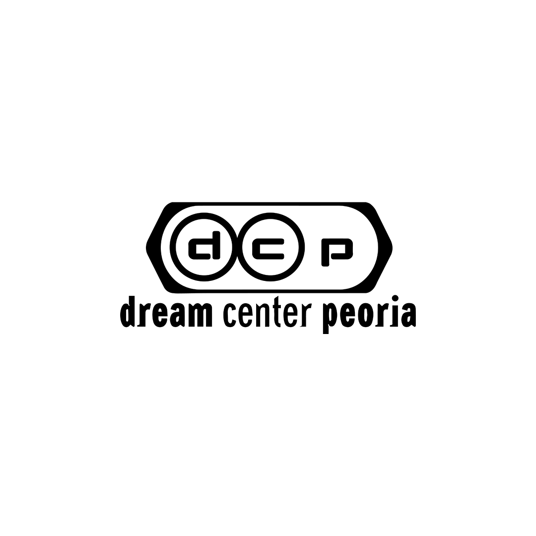

Secondary Logos
The secondary logo should always be used only when it fits the horizontal landscape better than the primary logo.


The Bug


Slogan


Don’t change the color of the bug

Don’t adjust the scale

Don’t outline

Don’t change the workmark

Don’t change the font

Don’t add ornaments
